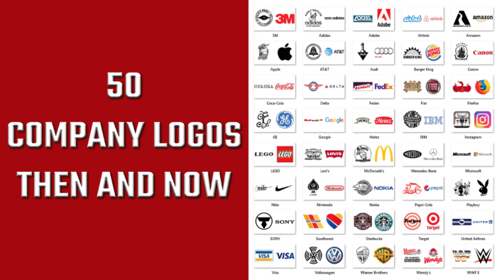
大家早就知道,徽标是品牌的脸面。只要标识易于识别,易于记忆,并能在脑海中重现,那么公司的销售就会成功。当一个好的视觉形象很容易反映企业的价值和特点时,它就会为消费者所熟悉。
耐克(耐克)等全球销售领导者早已明白,你需要从远处着手开展广告活动——正确的形象设计将有助于奠定正确的基础。
难怪在复杂的技术时代,简单的设计会吸引人们的注意力,让公众感到愉悦。为了不断跟上潮流并经得起批评,公司试图跟上潮流并通过美观、简洁或有意义的设计进入消费者的内心。
2015年做了一个有趣的研究,研究显示10个人中有6个人更喜欢购买一个熟悉品牌的产品。这并不奇怪,因为一个知名的品牌可以意味着质量和激发目标受众的信心。你喜欢的标志可以成为选择特定品牌商品的重要因素,因为你想参与一些好的、正确的、昂贵的或权威的东西。这就是消费者的心理,他们在购买时投入了一定的主观态度和愿望。
耐克
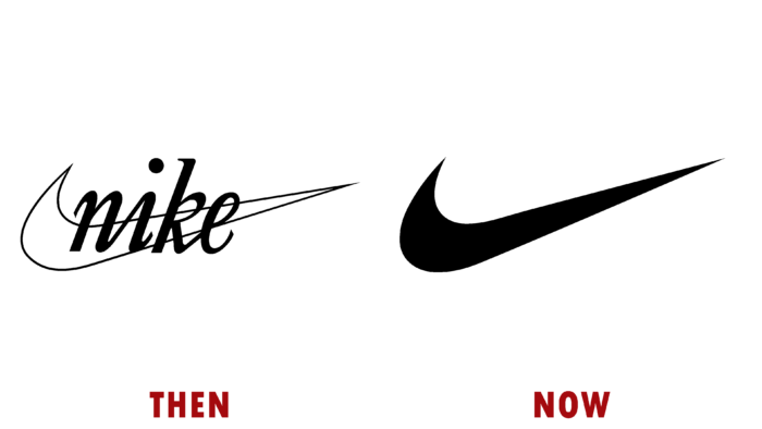

然后:
上述品牌最初名为蓝带体育,由比尔鲍维尔曼和菲尔奈特于1964年创立,1971年更名为耐克。品牌标志;徽标的价格只有35美元。波特兰州立大学的卡洛琳戴维森的设计开发为此付出了很多。最初,这是一个斜体题字,好像是用黑色钢笔在一个光滑的勾号背景上写的。
现在:
过了一会儿,徽标被最小化了,已经是一个全黑的简洁流畅的滴答,没有轮廓,边角更尖。虽然这个对号可能很孤独,但它是世界上最容易识别的视觉标签之一。
大众汽车
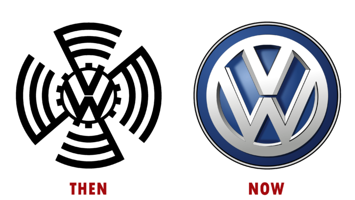
然后:
大众汽车,一个主要的汽车制造商,是在1937年由一个纳粹劳工组织为了制造汽车而成立的。制造商传达的信息很简单——任何德国家庭都可以拥有这样一辆车。最初的标志具有纳粹党所用的十字记号的特征,在当前的现实情况下,使用它会是冒犯性的,甚至更不合适。
现在:
2000年,他们开发了蓝白配色方案,让每位车主都有美感、权威感和安全感。没有黑色圆形条纹的杂乱,白色的会徽看起来友好整洁。
国际商用机器公司
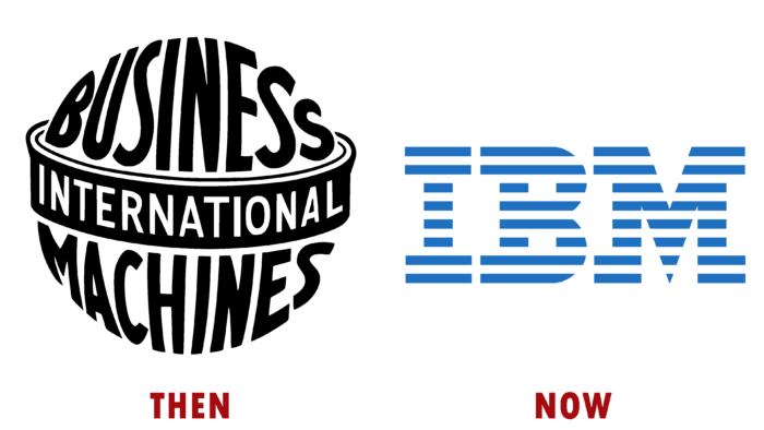
然后:
三家独立的公司在1911年合并成一家大公司。就这样,一个大品牌的医学学士诞生了,它在1924年获得了现在的名字(以前被称为计算-制表-记录)。最初,这个标志想展示全球化、覆盖全球、自信和对未来的展望。黑白配色方案非常适合圆形的标志字体。
现在:
随后,这个标志被保罗兰德设计的新标志所取代。设计师让品牌对买家更有吸引力;蓝色和白色表达了影响力和经验。
ATT

然后:
出现于1877年的TheATT曾长期垄断电信业。然后在1984年,亚历山大格雷厄姆贝尔(一)因一起民事反垄断诉讼被迫拆分。圆形会徽标志;徽标为黑白两色;圆圈的中心突出了一个钟,里面刻着"钟系统"。
现在:
现在这个标志看起来像一个蓝白相间的球体,字体名称为黑色;它看起来体面和谐,有人可能会说,它与时俱进。
百事可乐
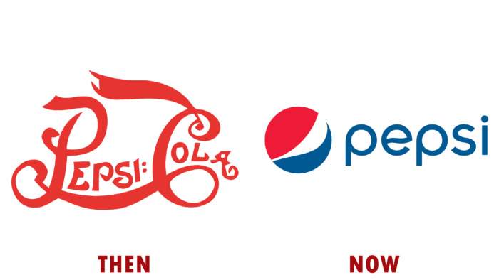
然后:
1893年凯勒布拉德汉姆发明了一种饮料——百事可乐,这种饮料后来在全球范围内变得非常流行和受欢迎。据了解,起初,这种饮料的定位和态度是作为改善胃肠道功能的一种手段,在北卡罗来纳州的药店出售。一个华丽而有趣的红色标志和独特的字体赋予了产品一种神秘的特质。这对购买者来说是一个很好的新奇产品。
现在:
后来标志换成了形式简单但颜色复杂的——红白蓝。这里你可以看到一个波,一个球体,运动。有几个意思。在该品牌126年的发展历程中,该标志发生了许多变化,但我们今天在商店中看到的标志是在2014年向公众推出的,此后一直没有改变。
星巴克
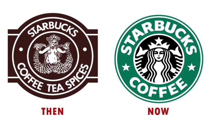
然后:
1971年,星巴克出现在西雅图派克市场。这个品牌的命名理念并不是最著名的文学人物——这是小说《莫比迪克》中名叫星巴克的阿哈的大副这个标志的主题是一个斯堪的纳维亚的海妖雕刻图像,伴随着16世纪的盛宴,当时拿出碗的想法刚刚诞生。
现在:
现在品牌得到了非常有力的推广和丰富——根据2018年(现在甚至更多!)在50个国家,拥有众多门店的公司代表处约3万家。标志上的警笛已经有了更纯洁的外观;她的头发覆盖了她的胸部,她的脸更加开放,表达了平静的喜悦,身体两侧整齐的尾巴,这一切都在一个绿色的边界与品牌名称。
联邦快递
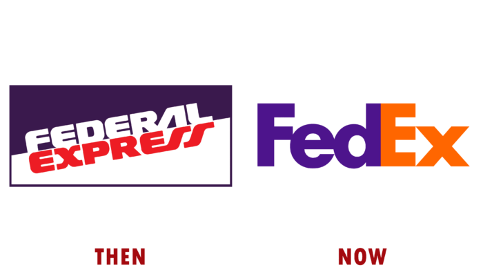
然后:
1965年,耶鲁大学的学生弗雷德史密斯开始思考货物运输的问题。他首先写了一篇关于货物运输的学期论文,后来在1971年,在阿肯色州的小石城成立了联邦快递公司。该公司运营的第一天标志着快递业的巨大改革,14架飞机在一夜之间将186个包裹送往美国的25个城市。除了字体与其他更正式的字体不同之外,edEx标识简单朴实。淡紫色,白色和红色的字母,以及未来主义的感觉在字体中被读出。
现在:
现在使用了更饱和的紫色,橙色取代了红色,总的来说,出现了一个不能立即看到的亮点——字母之间的间隙中有一个白色箭头,表示向前移动或速度。
微软公司(全球知名个人电脑软件厂商)
然后:
保罗艾伦和比尔盖茨在1975年创建了一个不可思议的公司,它已经成为微软软件的世界领导者。随着时间的推移,巨型产品出现了,使一个人的工作更容易、更有效率,公司更成功、更富有。这都要归功于Windows (1983年年)、微软Office (1989年年)和Internet Explorer 1.0 (1995年年)。1987年,斯科特贝克的"吃豆人标志"被公认为公司的经典标志。
现在:
2012年,在该公司的视觉识别25年后,一个新的标志在波士顿揭幕。四个彩色方块代表该公司的不同产品。红色、绿色、柔和的橙色和明亮的蓝色给用户留下了积极的印象,激发了用户的信心。
麦当劳
然后:
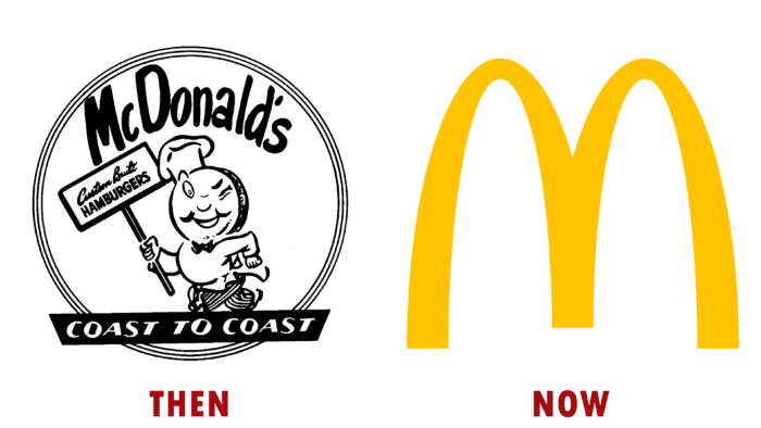
世界著名快餐品牌麦当劳的所在地,不起眼的圣贝纳迪诺。1940年,理查德和莫里斯麦克唐纳兄弟开始以35美分的价格出售带薯条的三明治。该公司的主要信息是这样的:速度,可用性,并易于提供朴实无华的小吃,以增加实力。第二次世界大战后,兄弟俩扩大了菜单,这保证了汉堡和芝士汉堡的受欢迎程度的提高。由于标志上有一个快乐的眨眼厨师,这给人留下了一个积极的印象,即食物美味可口,易于准备,并能迅速提供给饥饿的客户。
现在:
当前标志的首次亮相发生在1961年,当时出现的不是一个顽皮的厨师,而是一个金色的拱门,由字母m形式的平滑线条制成。颜色经过特别选择,以唤起食欲并与能量、和谐和舒适联系在一起。也许这个标志设法以这种形式吸引了更多的新消费者,所以现在餐馆在101个国家营业,每天为6900万人服务。
牛仔裤

然后:
李维斯特劳斯在他职业生涯的早期建立了一个批发服装公司,后来他把重点转移到了纺织品上,特别是牛仔裤。他的标志看起来既自命不凡又简单:坚持面料的强度和材料的整体高质量,所描绘的牛仔裤不会撕裂,即使被农民用马拉向不同的方向。
现在:
然后,另一个营销策略开始发挥作用,1967年,一个新的标志被引入——瓦特兰德和同事创造了一个设计,成为牛仔裤口袋的一部分。这是列维的名字中包含的红蝙蝠翼。因此,他们强调了牛仔裤作为一种产品的年轻风格和永恒性。
签证
然后:
信用卡在全球的传播范围非常大,不再是唯一的。每个当代人都至少有一张卡,放在钱包里。另一件事是,现在对数字技术和加密货币感兴趣是一种时尚。尽管如此,优秀的老信用卡,例如fromVisa,是这一类型中不会过时的经典。这家金融巨头于1958年发行了第一张信用卡,并在人群中引起轰动。当时的美国银行发行了一种名为"美国银行卡"的信用卡,这种卡有300美元的使用限额(这在今天几乎没有任何意义)。18年后,美国银行卡更名为签证,以加强其客户关系。说不同语言的人很容易说出这个名字。该标志仅基于两种颜色——蓝色象征天空,金色象征美国银行的诞生地加利福尼亚的丘陵地带。
现在:
时间流逝,品牌更新了设计。我们选定了一个蓝色字体的标志。它在渐变中有不同的色调,从最暗到最亮。从远处看,字母的颜色差异是不可见的,但它是存在的。最重要的区别特征是标志上没有金色或黄色。只是因为把金钱和黄金联系在一起的设计理念早已湮没无闻。
普通法规
然后:
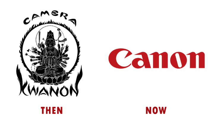
1934年,当时名为克瓦农摄影公司在其成立一年后发布了第一款相机模型。虽然它没有直接引用生产的技术,但该公司的名称是指佛教的观音。合乎逻辑的假设是,佛教中如此重要的人物应该是公司的象征,这应该会显示在标志中。于是多臂女神的形象出现了,它被火焰包围着。
现在:
早在1956年,就已经进行了品牌重塑,标志着我们今天所知道的未改变的标志的出现——这只是佳能公司的名称,用红色突出显示以表达关键信息——先进技术应该有一个全球标准。
奥迪
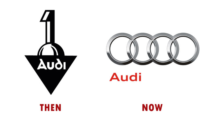
然后:
奥迪是当今世界上最畅销的汽车之一,以其豪华车而闻名。然而,它是在很久以前——1910年创建的。标志很简单,黑白相间。重点是数字1;三角形的底部是公司的名称。他们希望在汽车行业市场建立优势,并表明这家公司值得驾车者的喜爱和密切关注。
现在:
整个设计简化为和谐的圆形,让人想起徽章上的轮子,以及简单字体的红色字母。如果你能一次在标志中指出几个意思——生产的机器的质量、速度和优雅,为什么要聪明呢?
另一方面,可靠消息称,在1932年奥迪的竞争对手与该公司合并并组成汽车工会联盟后,为了增加对彼此的尊重,承认平等的努力,并代表各公司的不同命运,决定将四个交织在一起的圆环展示在一起。
火狐浏览器
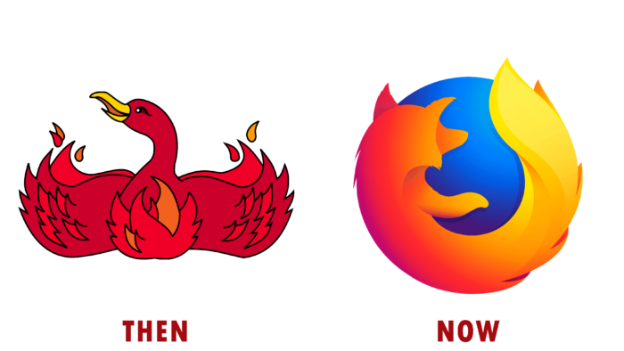
然后:
Mozilla Firefox应用程序出现于2002年,用于浏览互联网上的网页。浏览器最初是凤凰鸟的一种化身,被称为凤凰。由于商标纠纷,我不得不让步,改了名字。标志是一只亮红色的着火的鸟,长着黄色的嘴。这看起来有点奇怪和幼稚,但很快品牌重塑发生了,这个形象永远被遗忘了。
现在:
2003年,由于诉讼原因不能保留以前的名字,因此实施了一个新概念。于是就有了一个亮橙色的标志,或者更确切地说,是一只火热的狐狸,用它的整个身体围绕着一个蓝色的球。这个标志显示了公司的全球性和产品在用户中日益增长的受欢迎程度。
花花公子
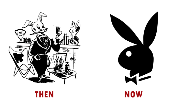
然后:
流行的男性杂志《男孩》诞生的原因既滑稽又简单——1951年,《时尚先生》杂志的一位名叫休海夫纳的文案被拒绝加薪5美元。过了一段时间,这个人在世界范围内名声大噪,成为了不同圈子里可以辨认的人。这一切都是因为他的杂志取得了难以置信的成功,他卖出了一百万份,成为了一个真正的大品牌,涵盖了夜总会,电视节目,甚至配饰和服装。代表这个雄心勃勃的男人的商店的标志看起来像一个完整的,详细的插图,一只穿着燕尾服,叼着雪茄的兔子,靠着一张桌子,一个女人的半身像,书籍,一个高脚杯和一个壁炉。这只兔子成了一般业余爱好者的缩影,可以说是情色小说。
现在:
虽然店主喜欢最初版本的标志,但他们不得不重新命名,并想出了一个新的简化版本。在杂志的第二期,出现了一个更简单的兔子形象——它的头转向左边,脖子上有一只蝴蝶。由阿特保罗于1953年设计。
亚马逊河
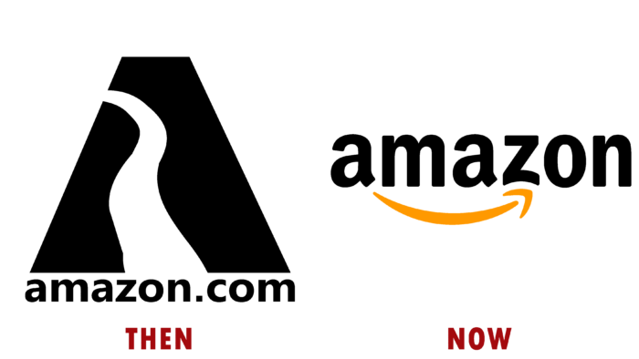
然后:
1995年,没有人会想到,在一个简单的车库里,杰夫贝索斯选择实施他的商业理念,一个品牌概念诞生了,它将为其所有者带来数百万的利润。这个概念是出售带有河流标志的书籍。这一信息有趣而不寻常——零售商被描述为"地球上最大的流量"
现在:
阿萨马松扩展了其业务,专注于提供跨类别的产品,新的徽标字体意味着您可以在网站上找到从A到Z的所有内容,快速获得您的产品,并在购物时安心。
乐高
然后:
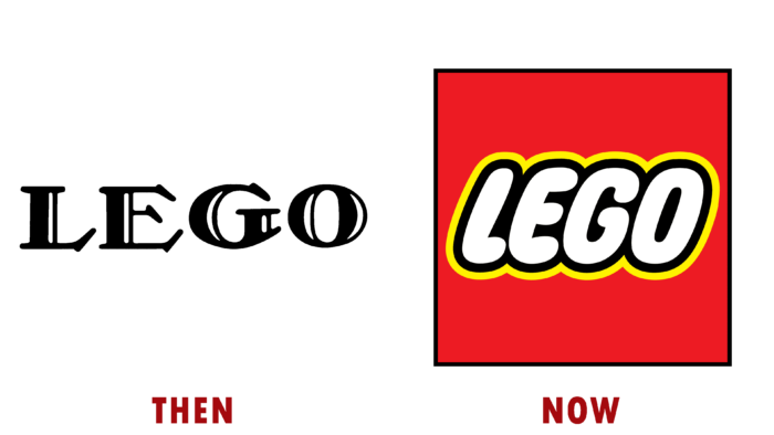
生产玩具的世界品牌的名字来自于两个丹麦单词——"好"和"玩"。1932年,该公司刚刚进入木制玩具市场,到1958年推出了其传奇的立方体玩具。其实一开始只是简单的衬线字体logo,丝毫没有透露出公司的本质。
现在:
1973年,生产扩大并出现在美利坚合众国的领土上,这给乐高公司的发展带来了新的一轮,同时也带来了品牌重塑。红-黄-白的印刷标志让买家感觉很舒服,想着在朋友中寻找玩具的美好时光。这成为了一个经典的标志;徽标造型,一直延续至今。
威瑞森
然后:
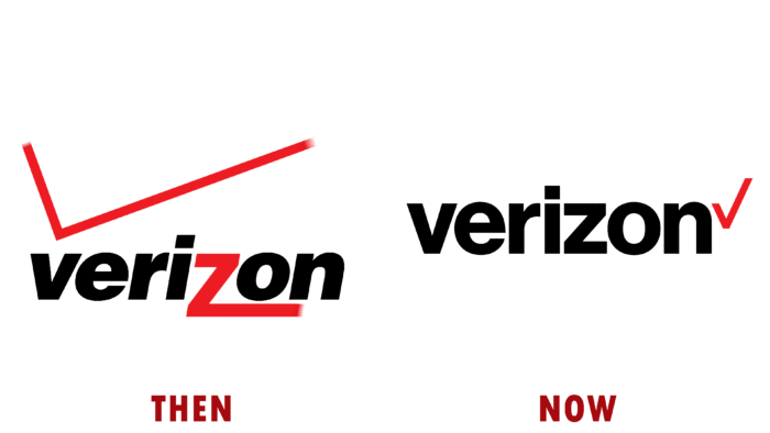
威瑞森的历史始于2000年,是贝尔大西洋公司和GTE公司合并的结果,这两家公司迅速发展并成为市场上的技术领导者。现在它是一个主要的移动运营商,覆盖了35%的市场。最初,这个标志是一个黑色字体的字母,上面有一个突出的红色Z和一个细细的勾号,但是后来被改变了。
现在:
2015年出现了一个更现代的标志,字体有所不同,复选标记变得更小,位于字母n附近。这种对齐掌握在公司手中,因为重塑品牌和确定市场中的新地位有助于赢得大量用户。
壳
然后:
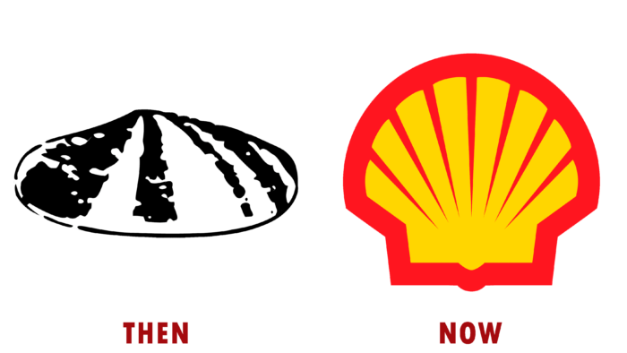
1833年,壳牌公司是一家古老的东方公司,现在它是一家大型能源公司,由于运作良好的进出口系统,它已经建立了自己的供应体系。贝壳的逼真形象已经成为该公司的标志。
现在:
过了一段时间,很明显,该公司停止了在某个特定领域的活动,转向了更高的技术水平。因此,在2015年,随着第一批服务站的出现,出现了一个新的标志——由黄色和红色制成的明亮的卡通外壳。为了表示对库珀的亲近
ation between California and Spain, these shades of color were chosen. YAHOO!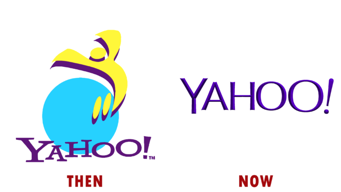
Then:
In 1994, Jerry Yang and David Filo were still students at Stanford University when they founded the Yahoo! project as a hobby, which later became a major brand. This is an Internet company, the fortune of which was estimated at 125 billion dollars. As a result of competitive pressure, Verizon had to sell it for 5 billion. The original logo looked like a blue ball with a yellow man – a stylization of the letter Y – with outstretched arms. And below, you can see a lilac inscription with the project’s name.
Now:
In 2013, when there was still no talk of selling the company, a rebranding was carried out, during which there was an attempt to restore its position and strengthen its status in the market. They retained the purple color for the font logo, but, unfortunately, the visual image update did not lead to positive results, resulting in another company’s decline and takeover.
DELTA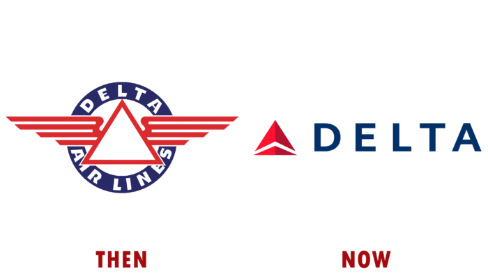
Then:
Initially founded in 1924, the American aviation company Delta Airlines positioned itself as a commercial agricultural enterprise. However, since 1929, the first passenger flights were made. The visual identity of the period was a large Greek letter “delta” with outstretched wings. It was placed in a wide ring, against which the company’s name was placed above and below the letter. National shades were used as a color palette, adding a touch of patriotism.
Now:
The current version of the logo is also made in the form of a stylized letter. However, it is also associated with a plane taking off the runway. Thus, the brand fully reflects its field of activity, hinting at the seriousness of the approach in fulfilling obligations towards customers. To the right of the emblem is the word “Delta,” made in a laconic style, which adds rigor and conservatism to the image.
APPLE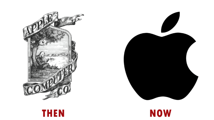
Then:
Steve Jobs, in 1976, together with his friend Steve Wozniak, founded a small company at that time, Apple, engaged in the development of computer technology. And in 1978, the first revolutionary PC, the Apple II, was introduced to the market. They presented their original logo in the form of an ink-drawn picture, against which, under the famous apple tree, before the very discovery of the laws of gravity, Isaac Newton was thinking. The image is entwined with a ribbon with the company’s name, which emphasizes the desire of the creators to become pioneers in their field of activity.
Now:
The old model of the visual identity was replaced by a laconic and memorable image of a bitten apple, which is still used today. Subsequent brand changes implied only a play with colors, which focused on the prestige and quality of products. The palette has acquired monochrome shades, which indicates the seriousness of the company and the growth of its image.
GE
Then:
The General Electric Company is the world’s largest energy company. Thomas Edison founded it in 1890. However, two years later, it was decided to merge with a competing product to expand its capabilities and further development. The logo was the letters “G” and “E” from the name, in cursive handwritten calligraphy in a black monochrome palette.
Now:
The modern version of the company’s visual identity has undergone major changes. One of the reasons for this was the globalization of the enterprise. The monogram image has acquired greater conciseness and symbolism of unity. It was placed against the background of a circle of a blue tint, implying the provision of its services around the world. In addition, due to the white ring surrounding the inscription with small processes, a semblance of a working turbine screw is created, which is directly associated with the energy direction.
ADIDAS
Then:
The German company Adidas was founded in 1925 by Adolf Dassler. During its heyday, the company’s logo was an image of studded sports shoes, above which the name of the creator was placed in an arc, and below it was the name of the brand. The font was used without any unique features. The only addition to the individuality of the image was the lengthening of the lines of the letters “d,” which can be associated with a sports obstacle. The color palette included only black monochrome.
Now:
When the company expanded its production and began to produce clothing elements, it was decided to change its visual identity. A memorable element of the logo was three stripes inclined at 30 degrees, which resembled a mountain, which in essence was a symbol of further development and growth. Since 2005, there has been a simplification of the brand, whereby the three stripes are placed horizontally on top of each other, and to the right of them is the name in an individual style with rounded letters.
NASA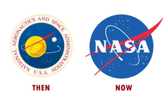
Then:
NASA was founded in 1958 as a response to the first launch of the USSR satellite in 1957. Under the support of a representative of the research center, a unique logo was created that fully reflects the enterprise’s activities. It was a circle of a blue tint with a golden edging; on the background, there was an image of a planet, a satellite, stars, and a spaceship flying in orbit. Around the composition along the outer contour, the agency’s full name, also taken in a golden outline, took its place.
Now:
In the subsequent period, changes were made to the visual identity related to the simplification of the image itself. The logo consists of one blue circle, in the center of which is the abbreviation “NASA,” and around it, the orbital trajectory is drawn, and there is a scattering of stars. At the same time, an aerodynamic jet trail was depicted in a red tint, going diagonally to the right through the entire area of the circle. This implies different areas of activity.
BURGER KING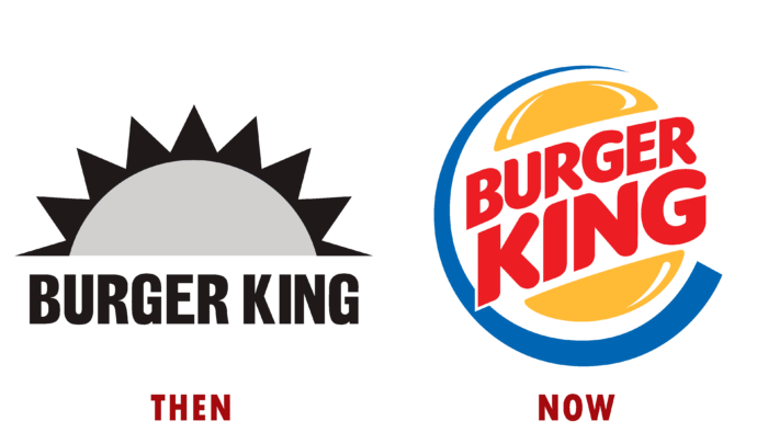
Then:
The first branch of Burger King opened in 1953 in Florida. He endured a series of hardships that led to ruin. However, in 1961 the restaurant was bought out, and after a long reconstruction, it was reopened all over the USA. The logo was concise and immediately caught the eye. It was stylized as a rising sun, which is equally reminiscent of the view of the burger from above. Thus, the direction of activity and the dawn of the public catering network were concretized. Below the image was the brand name in simple, bold type.
Now:
The current visual identity has received a new color scheme and has undergone dramatic changes. The stylization of the sun began to resemble two halves of a golden-hued bun, and between them, in two rows, there was a “Burger King,” in red, like a filling. The text is made in bold type with rounded edges, which expresses goodwill and responsiveness. Around this emblem is a segment of the ring, which becomes thinner towards the top edge.
ADOBE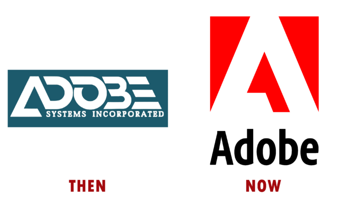
Then:
Charles Geschke partnered with Jhon Warnock to form Adobe Systems in 1982. In five years, they presented their new creation Adobe Illustrator, which brought them their fame and the right to further development. The first visual identity was a rectangular horizontal background with a dark gray infill. It contained the enterprise’s name, the main word of which was highlighted in a separate unique font, creating a trapezoid figure.
Now:
The logo was updated in 1990, which resulted in several changes. The background was transformed into a square of a red tint, against which the letter “A” was placed in white, which retained the original design. Under the image, the text “Adobe” was placed in a regular font, which was slightly narrowed to the width of the main visualization. This meant the simplicity and clarity of the interface, which will not cause difficulty in mastering new users.
UNITED AIRLINES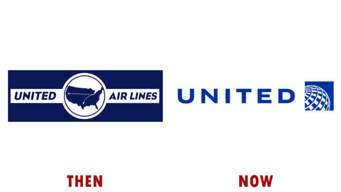
Then:
The air travel company made its first passenger flight in 1926. The logo was introduced in 1973 in the form of a horizontally placed dark blue rectangle. A white stripe passed through its center, on which the name of the enterprise was applied on both sides of the central image. The brand sign implies a white circle with a smaller diameter ring in the same color scheme as the background itself. And inside the ring is the silhouette of the territories of the USA, wherefrom one city, two arrows indicate a flight to two other places.
Now:
Despite its popularity, United Airlines underwent a merger with Continental Airlines United after the end of its history. The visual identity has also been changed. Its performance follows the present trends, indicating performance conciseness and increased memorability. Thus, the merger of the two companies was emphasized. The logo is a dark blue square against which a structured image of the earth is placed.
3M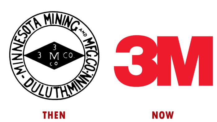
Then:
3M was founded in 1902. The main activity is connected with the chemical industry and everyday goods. The logo was presented in the form of a white ring with black inner and outer edging. The enterprise’s name was placed along its perimeter, and in the center, there was a horizontal rhombus, against which the text “3M Co” was placed vertically and horizontally crosswise.
Now:
Over the entire period of the company’s existence, there have been many emblem variations. However, the final visual identity, introduced in 1978, was an image of a bright red hue, consisting of two characters, namely “3M”. Laconic execution increases the level of memorability, which is extremely important for an enterprise planning further expansion and development.
TARGET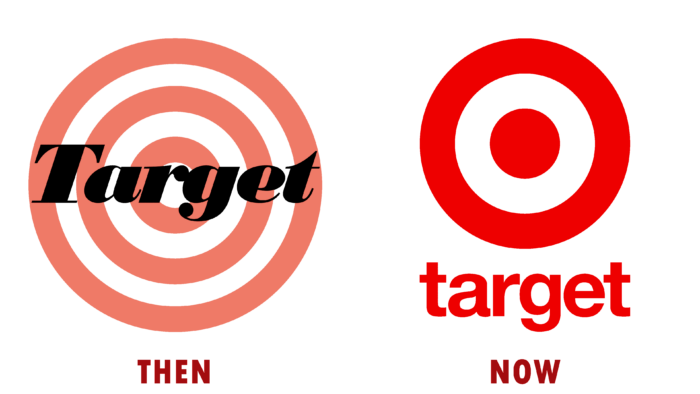
Then:
Target Department Store is an offshoot of Dayton Dry Goods, founded in 1902. The logo for him was original and had a personality that helped increase the memorability among visitors. It is presented in the form of a target of white and red rings. The name of the store is placed in the central area. Thus, it was planned to reflect the desire of the network to provide the most popular products.
Now:
In 1968, it was decided to change the visual identity, refreshing the brand in line with modern trends. In addition, this was also due to the expansion of the network of department stores throughout the country. This resulted in an emblem with a richer color palette and simple execution. The target was still the main distinguishing feature of the logo; only the number of rings was reduced to two. The text itself was decided to be removed.
FORD
Then:
The Ford Motor Company was officially registered back in 1903. She specializes in the creation of automotive products. However, at the beginning of her career, she was not so famous, which changed after the release and sale of the first model. The first logo was presented in the form of a horizontally located oval, which braided ornate branches around the perimeter. Inside the figure, an oval ring of smaller diameter found its place, resembling a bracelet due to pearls added to it. The central part was assigned to the name and the city in which the enterprise was founded. The brand exuded luxury and conservatism, which is what distinguished the produced cars.
Now:
The history of visual identity is extensive, as it has been constantly mutated until it got its current variation. The calligraphic text used in the emblem was created by Childe Harold Wills and placed in the very center. A flattened oval ring is located around it, and all this is located against the background of an oval figure in a gradient fill of blue hues. At the same time, due to the use of shadows, the composition acquires volume. It is still a symbol of high-quality and safe products to this day.
WWF/E
Then:
WWF/E was founded in 1963. However, the federation acquired its current form only in 1982. She united under her leadership many professional wrestling clubs, which led to creating a national league. The logo was minimalist yet full of elegance. It is presented in the form of two wrestlers who came together in a fight in the ring. Thus, the main attention was focused on the type of activity of WWF/E. To the right of the image was the full name of the federation and the abbreviation placed against the background of a black rectangle.
Now:
In 2014, viewers were able to see a new updated visual identity. It implies smooth letters “W” placed one above the other with pointed ends, which emphasizes the seriousness and severity of the events. Behind them is a stroke of red, which brings a touch of aggression and confrontation into the composition. John Lifteratos took part in the creation of this logo.
WWF
Then:
The need to protect the environment worldwide led to the merger and creation of the World Wildlife Fund in 1961. The image of a panda, which arrived at the zoo in London at that time, was used as a logo. Under this pretext, one of the founders, Peter Scott, created a simple sketch, which laid the foundation for further developing the community’s appearance. Initially, it was a hand-drawn ring in which a panda settled down, pitifully casting a glance at the one who looks at the emblem.
Now:
A quarter of a century later, the visual identity has been transformed using digital technology. The animal turned out to be more graceful and acquired clarity, although it also had a downcast look. Rounded details gave it softness in perception. So the association directly stated that animals also want to have a good life in our world. Under the image, the abbreviation “WWF” was placed, executed in bold type with rounded letters.
GOOGLE
Then:
To date, Google is the Internet resource with the highest traffic. However, it was inconspicuous and little known during its creation, which fell in 1997. The main office was located in an old garage, but three years later, demand grew exponentially, and the website began to gain popularity. The first logo was used only at the stage of the tested version, representing the letters of the name, executed in a different color palette and at different angles. At the same time, they added the effect of a three-dimensional image. It was unusual and colorful, which attracted new users well.
Now:
Today, nothing remains of the forms of the former visual identity. Only the color palette, consisting of blue, red, yellow, and green shades, is unchanged. The “Google” text is in bold Muguet type, which was designed specifically for the company. There are no serifs in it, and the letters are arranged in a strict style, which emphasizes that the company has already earned its status in society.
COCA COLA
Then:
Dr. John Pemberton, in 1886 developed the mixture, which is now in great demand, with more than 1.9 billion servings worldwide daily. In creating the name and brand for the drink, Frank Robinson helped him, who proposed a simple version of “Coca-Cola,” which is still used today. The first logo was a name written in simple letters on a typewriter, which lasted only a year.
Now:
Subsequently, it was decided to create a clearer visual identity, and Frank applied his calligraphy skills to this. The result obtained was taken as the basis for the further development of the logo. The color scheme and approach to performance changed, but the overall style remained unchanged. Thus, in 2003, with digital technologies, the company presented its final version of a dark red shade, made in italics and with elongated letters.
WARNER BROTHERS
Then:
The love of films led to the fact that Warner Brothers, in 1903, decided to establish their film studio. For 15 years, they have spent a lot of time perfecting their skills. The result of their labors was the full-length film “My Year in Germany.” With the proceeds, they bought a room for themselves and continued to develop further in small steps. The logo is presented in the form of a black rectangle, in the center of which there was a shield, against which the image of the same studio, and under it the company’s abbreviation.
Now:
The current variation of the visual identity was created back in 1925. It is executed in a three-dimensional style, which creates the effect of the presence of elements in front of the viewer. The shield is presented as a triangular figure with rounded sides and steps in the upper corners. The letters “WB” are placed flush with it in its center, executed under the shape of a shield. At the same time, behind the letters, there is a background in a gradient filled with blue tints in the recess. The visualization itself is surrounded by a golden ring, on the surface of which the voluminous full name of the studio is placed. It symbolizes integrity and the desire to cooperate with other companies.
INSTAGRAM
Then:
In October 2010, Instagram was born – the creation of two talented people, Mike Krieger and Kevin Systrom. It was a new social network that allowed you to share photos with each other online. The app’s popularity stood at 27 million active users in less than two years. The logo was an image of a non-original Polaroid camera with a rainbow stripe in the center. Because the resource was supposed to be exclusively for photographs, it was decided to give it a retro style. The color palette included a combination of light milky, gray, black, red, and other shades. So it was possible to achieve a unique performance, which allowed the brand to stand out from the others.
Now:
The visual identity in use today was not immediately to everyone’s liking. However, this was necessary due to modern trends. The emblem is made in a laconic style and is a square with rounded corners with a gradient filling of blue, red, and yellow tones. In the central part of the figure, the outline of the camera is placed, repeating the shape of the main sign on which the lens is highlighted. In its upper right corner is a flash eye.
AMERICAN AIRWAYS INC.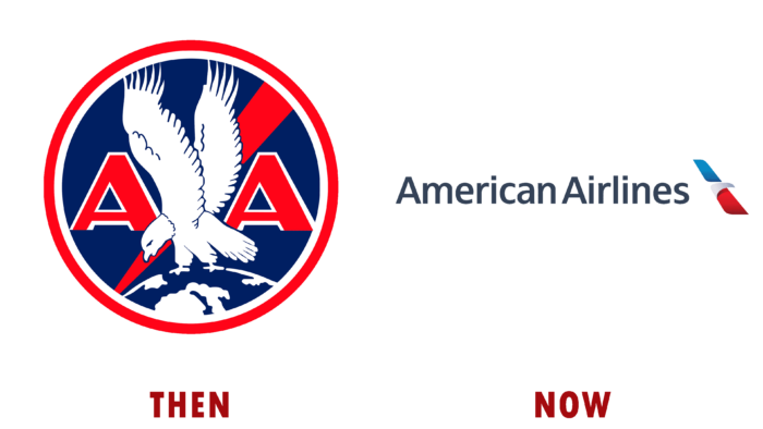
Then:
American Airways Inc. was established in 1930 by merging small independent enterprises into one single structure. In 1934, on this basis, it was decided to change the name used to this day, namely, American Airlines. The logo was made in national colors, and the main element was a monochrome image of an eagle spreading its wings and standing on a segment of the earth. All this is placed on a dark blue background. On the sides of the animal are two letters, “A,” denoting the enterprise itself. A line of red tonality is depicted diagonally behind. At the same time, the entire emblem is surrounded by two rings – white and red.
Now:
In 2013, the US Airways Group joined the company, increasing its reach capability requiring a brand redesign. Thus, the new logo received a concise and unique variation corresponding to modernity. The current emblem is presented in the form of a runway inclined at 30 degrees, divided into two parts by an arch thrown over it. This is how a simplified visualization of the eagle is created, which fully reflects the association’s nationality and type of activity.
MERCEDES-BENZ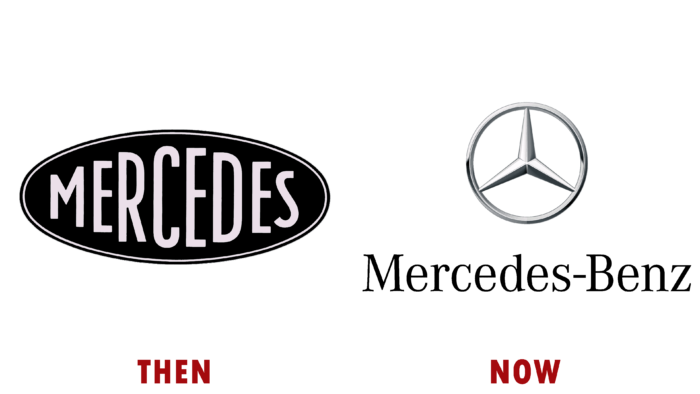
Then:
The original company consisted of two independent structures founded in 1886, one led by Karl Benz and the other by Gottlieb Daimler. However, in 1926 they decided to merge into one company, called Mercedes-Benz. The primary logo was a flattened horizontally placed oval of black monochrome filling. An oval ring of a slightly smaller diameter passed along its contour. At the same time, the text “Mercedes” is located in the center, made in ordinary letters of different heights. This implied the integrity and independence of the created association.
Now:
The current visual identity is made in the form of a ring, in which a three-pointed star has found its place. The whole composition includes a color palette of various gray shades. This is how the effect of metallization and volumetric elements is achieved. Many people call this logo “silver star,” which fully reflects its essence. Under the sign is placed the enterprise’s name, made in a serif font. For a three-dimensional effect, it was decided to add a shadow.
AIRBNB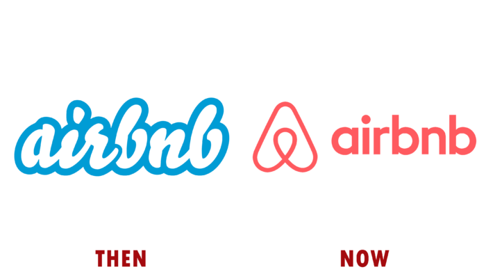
Then:
Airbnb was founded in 2008 by three guys, Nathan Blecharczyk, Brian Chesky, and Joe Gebbia. It is an online platform that allows you to find residential premises for short-term rent. They presented their logo in the same year, including a text component. The white cursive lettering had a thick blue border, adding friendliness and lightness to the brand. The division into two parts occurs due to the easy imposition of the first word on the abbreviation “bnb,” which implies reliability and confidence in the professionalism of the company’s employees.
Now:
In 2014, a revised variant of the visual identity was introduced, which looks more concise. However, the abstraction placed to the left of the brand name has a lot of semantic meanings in its arsenal. It can be an arrow that indicates the direction, the house’s roof that provides protection, and much more. Nevertheless, the freshness of the image allows you to attract due attention. The text is made in simple printed letters with straight lines, further facilitating the logo from unnecessary details.
CHEVROLET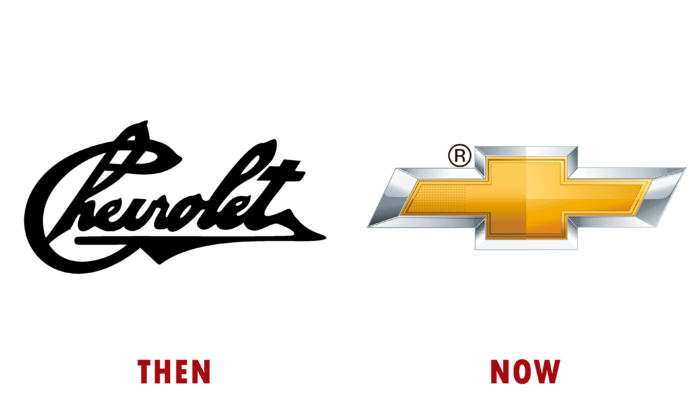
Then:
In 1911, the Chevrolet automobile company was founded, led by William Durant. He wanted to make equipment so tha

总监微信咨询 舒先生

业务咨询 付小姐

业务咨询 张小姐