
第一次提到向他们的后代传递有意义的信息可以追溯到旧石器时代,当时历史是用洞穴绘画来表达的。于是人类从动物世界中脱颖而出,虽然与动物世界留下了无形的联系。在未来,这导致了纹章学的出现,因为在纹章和标志的图像中,他们试图将某些特征表现为氏族、国家或企业的特征。因此,大多数品牌的汽车产品都包含了动物的代表,这些动物在它们的独特标志中有着历史或象征性的基础。
每一种动物都象征着一种特定的品质或组合,这种品质或组合是他所固有的。所以品牌有一个合适的logo,体现产品的优势。公司在视觉识别的利基市场中占据着特殊的位置,拥有特别配置的专属汽车,例如保时捷、法拉利、兰博基尼等。他们中的许多人暗示特权,这影响了他们的价格。
带有马的汽车标志
马是一种强壮的动物,具有不可动摇的性格,因此它的形象被认为是最受欢迎的创造标志。不管这个国家的文化差异和宗教信仰如何,它的象征意义保持不变,象征着力量、美丽、自由和优雅。有时这个意思也暗示了火、风和水的原始元素。因此,无论如何解释这个符号,它仍然意味着活动和运动。
因此,您可以指定单个设计元素或整个作品的风格和优雅程度。强调对胜利的渴望,宣布他们真正的力量和速度,辅以流畅的形式。反映故事的一部分,用自由的精神和不可阻挡的角色来加强它。马形象的多面意义使其有可能在不同领域和方向的视觉识别中使用。
佩加索

佩加索是一家西班牙公司,从1946年到1990年,从事发动机、拖拉机、卡车和汽车设备的生产。该公司没有生产两个相同的模型,因为在制造每个车身时都考虑了客户的意愿。1990年,Enasa公司收购了该商标,1994年该商标不复存在。
标志徽章是以一个神话般的飞行生物的单色图像的形式呈现的,充分反映了品牌名称。表演的独创性在于轮廓清晰,与圆形框架分离。它象征着果断的行动、自由和速度。徽章有很强的战斗精神,突出了公司的优势。
法拉利
这家意大利汽车公司于1947年在马拉内罗成立,致力于生产运动和赛车用汽车产品。然而,它源于1929年创建的法拉利车队,该车队赢得了15个世界冠军和大约16个车队冠军。该品牌最大的成功带来了对一级方程式赛车等比赛的参与。
标志的主要元素是单色调色板中的一匹骏马。最初,它意味着对飞行员弗朗西斯科巴拉卡的纪念。它象征着速度、自由和力量,这些都是法拉利汽车的标志。
宝骏
2010年,中国企业宝骏成立,生产低成本汽车产品,是别克和雪佛兰等公司的替代产品。从生产的第一年起,销售的急剧增长表明价格和质量的可接受组合,这导致了品牌的扩张和经销商网络的出现。
视觉标识以马头转向一侧的形式呈现,置于盾牌内部。构图看起来很现实,传达了象征这种动物的自由和高贵的精神。细节上的简洁,讲的是保守,强调的是这个品牌汽车的可负担性。渐变的调色板让人联想到银色在光线中的反射,为品牌增添了一丝贵族气息。
保时捷
1931年,费迪南德保时捷在斯图加特成立了一家公司,生产运动和越野车。在第二次世界大战期间,该公司为一种重型坦克创造了几个项目,其发展被用于创造坦克歼击车.迄今为止,该公司的产品以高性能和高质量著称。
保时捷标志将符腾堡盾形纹章和斯图加特盾形纹章结合在一起,由一匹直立的马组成,位于图案的中央。因此,他们决定向德国的历史和主办公室所在的城市致敬。会徽已成为奢侈和高地位的象征,这也是该品牌在全球获得广泛认可的原因。黄色和红色的阴影,加上黑色的轮廓,象征着特权,反映了该国国旗的颜色。
卡玛斯

该公司自1969年以来一直生产柴油发动机、卡车和公共汽车卡玛斯。的主要生产设施位于纳贝日涅切尔尼.十九个国家参加了它的装备,包括美国、日本、加拿大等。十年来,该工厂完全证明了投资于它的资金是合理的。
会徽描绘了一匹草原马阿尔加马克奔驰在田野上,以忠诚、聪明和灵巧而著称。它象征着速度和巨大的力量,直接反映了产品的主要品质。同时通过这种方式表达了企业进一步发展壮大的愿望。标志采用简洁的单色风格,从中可以看出美丽和高贵。线条没有明显的过渡,表示友好和合作的意愿。
科雷拉独角兽

1901年成立于法国莱瓦-佩雷。它从事开发和生产汽车设备,直到1947年,发行了33,962份。1950年,该公司关闭了。
该标志的特色是一个独特的徽章,取自科雷家族的纹章,被描绘成一只面朝左的独角兽。所以创始人强调自己属于这个古老的家族。此外,制造产品的功率和速度参数以这种方式被符号化。调色板以红色为主,这表明该公司在其活动领域的快速发展。此外,圆环上的会徽意味着独立和遵循自己的传统。
伊朗卡德罗
这家股份公司生产公共汽车、运输部件、客车和卡车。它于1962年在伊朗德黑兰成立106 . IKCO生产13种不同品牌的设备,是北非、近东和中亚最大的制造商。
在标志中,主要元素是一匹马的侧面图像,指向右侧,表明企业的进一步扩张。标志放在盾牌上,象征着可靠、力量和自由的精神。体积与简洁的构成相统一,暗示着可承受的价格和对顾客的信任。这一点可以通过灰色和蓝色色调的对比清楚地表达出来。
埃歇
一家印度中档商用车和摩托车制造商,其历史可追溯至1948年的新德里。它包括皇家恩菲尔德汽车公司的子公司,专门生产摩托车产品。迄今为止,埃歇正在投资于定制设计、指南和地图的潜在发展。
视觉识别以水平放置的红色椭圆形表示。在它的背景下,一匹马的侧面被雕刻,指向左边,它的鬃毛在风中形成条纹。这象征着动态运动、速度、自由和活力。标志的调色板反映了勇气和激情,结合稳定,强调解决任务的负责任的方法。
福特野马
福特汽车公司的汽车系列从1964年一直生产到今天。这种产品的积极广告宣传被认为是汽车工业历史上最成功的。机械单元的开发实现了统一,并使用了低成本型号的零件。
福特野马商标以一匹向左飞奔的马的形式呈现,体现了设计的汽车所投入的美国精神和力量。会徽以流畅的线条为主,突出了头部、尾部和蹄部的急剧变化。所以重点是正在生产的车型的野脾气和速度。它的单色和简洁表现了整个系列不可或缺的保守性。
卡尔松
卡尔松汽车技术公司调谐工作室是世界闻名的梅赛德斯-奔驰汽车改装制造商。它于1989年由安德列亚斯和罗尔夫哈特格兄弟在梅尔齐格成立。该公司还以其各种各样的合金车轮而闻名。
在该公司的视觉识别中,一匹奔跑的马的轮廓是主要元素,它意味着克服困难的动态发展——会徽呈环状,象征着企业的完整性和独立性。配色方案的选择是为了强调产品属于汽车的精英阶层。在马的会徽下,工作室的名称以小写字母放置,字体为国际茶叶委员会(International Tea Committee)的克里利粗体斜体,没有任何特殊变化。该文本以流畅的线条为特色,讲述了建立在友好基础上的关系。
带有格里芬的汽车标志
狮鹫是一种拥有狮身、鹰头、翅膀和爪形脚的生物。在传说中,他被赋予了守护秘密知识或宝藏的使命。它象征着力量和警惕,象征着地面和空中的统治力。通常,他们使用一个神话生物的完整形象,这样就不会有关于它未来归属的问题。它可以是结合不同元素的抽象,也可以是详细的图像。用草图来指定轮廓也是足够的,如果标题明显是指他,强调传奇人物的存在。
冈佩特

2004年,奥迪前首席执行官罗兰冈佩特在登肯多夫建立了他的豪华跑车制造厂。2008年,阿波罗运动的成功创作亮相展会,打破了帕加尼佐达风和布加迪威龙等车型的速度纪录。然而,由于破产,该事务所于2013年关闭。
冈佩特的视觉标识包括一个盾形徽章,其表面有一只狮鹫。背景的调色板是酒红色调,并以金色框架作为下划线,象征着产品的精致。神话中的生物是一个强大的纹章符号,反映了优雅。由于在色彩中使用了各种深浅不同的浅灰色,它看起来是活的,这给构图增添了动态和力量。
萨博
该公司最初成立于1937年,从事制造军用飞机,这就是为什么第二个字母被解读为"飞机"。该公司最大的名气是由单座战斗机Viggen 37带来的,它展示了它最好的一面。从1949年开始,生产转变为汽车生产,这也影响了缩写。
这个品牌标志是在他们的工会解散后从斯堪尼亚借来的。这是一个红色狮鹫的皇冠头,描绘在侧面,看向左边。这强调了技术设计的力量和对细节的警惕。下面,在银色渐变填充中,放置了SAAB公司的名称。整个结构由象征公司独立性的圆环环绕。
国际标准化组织
从1939年到1974年,这家意大利公司生产汽车、摩托车和踏板车产品,在布雷索设有运营设施。最成功的车型是Grifo GL 365,其速度超过了255公里/小时,然而,尽管付出了努力,1974年,该公司因破产而关闭。
会徽以长方形白色盾牌的形式呈现,以黄金为框架,其下部有突起,上部有切口。中间是一只直立的狮鹫,看向左边。这一切都强调了解决设计问题的方法的严肃性,象征着警惕和毅力。在这个生物的后面是国家颜色的垂直线,在它的上面是深灰色的草书单词“Iso”,带有金色的边框。这幅作品让人联想到财富和奢侈。
沃克斯豪尔

英国汽车公司,现在是斯特兰蒂斯的一个部门。自1857年以来,她一直在开发和销售蒸汽机。然而,在未来,活动类型转变为汽车行业,并在20世纪中期,该公司开始与德国制造商欧宝合作。随后,沃克斯豪尔商标被用于在英国销售欧宝和霍顿的产品。
视觉标识是一个圆圈,里面有一个狮鹫的正面。他右手拿着一面旗帜,上面刻着字母" V .他的躯干转向右边,他的头转向左边。这象征着对公司过去的记忆,这让我们为进一步发展而努力。会徽看起来简洁,但结合所有元素使其充满高贵和对未来的信心。红色和灰色的调色板只强调这些品质。
斯堪尼亚
它成立于1891年;这家瑞典公司最初从事制造自行车和货车。自1920年以来,该企业一直在接受再培训,以生产电机,汽车,卡车和公共汽车产品的商业和工业需求。自1968年以来,它一直与SAAB合作,这就是为什么它通过重型卡车赢得了知名度。
该标志的历史可以追溯到1984年,当时来自斯凯恩县纹章的加冕狮鹫形象被作为该品牌的一个独特元素。它意味着勇气、力量、速度和对细节的关注。现代技术使得简化品牌的视觉化成为可能,这增加了品牌的感知度,并确保了更好的记忆。描述标志基础的圆圈,结合超出它的部分,象征着合作的意愿。
带有鹰的汽车标志
鹰经常出现在各种公司的标志或各国的盾徽上,因为在纹章学中,它被认为是权力和力量的象征。许多人视他为太阳的使者,代表不朽的生命、自由或勇气的神圣使者。在《双头变奏曲》中,他被赋予了正义战胜邪恶的角色。在基督教出现的时期,他成为十字架的化身。
今天,天空之王被用来强调骄傲和一个人意图的迅速和严肃。无论它的执行风格如何,无论是细节轮廓还是轻轮廓素描,它仍然会具有感染力,吸引人们的注意力。放在盾内,帝王掠夺者永远象征着自由。在某些情况下,甚至可以不划定明确的界限。
鹰

从1988年到1999年由美国克莱斯勒公司拥有的一个部门,总部设在奥本山。它是在陆军装备司令部(Army Materiel Command)企业的基础上创建的,具有大规模生产乘用车的前景。法理上的困难导致了商标的进一步废除。
品牌标志以盾牌的形式呈现,类似于具有两个弧形边的三角形。在它的中心是面向右边的鹰头轮廓,结合了线条的锐利和平滑。这个形象的象征意义在于它所蕴含的力量、速度和发展欲望。标志上方是小写字母的单位名称,为图像增添了独创性。会徽的颜色由浅灰色和深灰色组成,给人以哑光银的感觉。
FPV
自2002年以来,FPV品牌一直是澳大利亚福特汽车公司的一个部门,并于2014年停产。在其存在期间,一系列基于猎鹰的高档汽车在其标志下开发出来,在消费者中获得了成功。
企业的视觉形象有两种单色调色板——蓝色和深灰色。会徽是一个粗细不等的椭圆形轮廓,中间是一只指向左侧的鹰的轮廓。清晰、锐利的眼睛和喙强调了它的侵略性和危险性。这象征着生产的汽车的速度。标牌下方的文字《FPV》采用斜体Snasm粗斜体,标牌下方略有改动。
伊斯代拉
一家生产汽车产品的德国私营公司,1969年成立于希尔德斯海姆。该公司生产限量的豪华运动器材,因为一组专家手工组装每个型号。这款车是为特定客户单独开发的,因此生产时间长达六个月。
该徽标以verti的形式呈现
cally placed sky blue rectangle with a black outline. Against its background, a flying eagle is depicted in monochrome, spreading its wings. This implies a serious approach to the manufacture of unique automotive products. Despite the laconicism of the emblem, it is filled with power, which is expressed in every line. The enterprise’s name is placed in the bold non-standard font at the bottom of the badge. Car logos with lionFor many centuries, the lion has been considered the most popular symbol in heraldry. Historically, he is the personification of power, courage, courage, courage, and dignity, having the title of the king of beasts. Its frequent use in various symbols has led to the fact that each pose has its specific name. The most common presentation of visual identity is in profile, which emphasizes the existing grandeur. A born leader can inspire respect along with fear. It is often associated with the image of the Sun, implying nobility in appearance and superior physical qualities. Today there are many brands whose logo uses the image of this animal. In the automotive industry, this is how leadership qualities, backed up by courage and strength, are indicated.
INKAS
Canadian private security corporation INKAS was founded in 1995 in Toronto. One of the categories is the development and manufacture of armored vehicles. In 2015, the first exhibition center was opened, which expanded products outside the country and the continent.
The logo is presented in the form of a shield, against the background of which a winged lion is depicted in profile, denoting a vigilant guard standing on the protection of the car owner. He has a sword facing the sky in his front paw, implying seriousness, stamina, and self-confidence. Below is the text “INKAS” with increased spacing between letters. The whole composition is made in an angular, laconic form with a monochrome light gray tint. So the emblem took on a more menacing look.
MAN AG
The European concern, whose history dates back to 1758, is today a subsidiary of Traton SE. The main direction of the enterprise is the development and production of heavy commercial vehicles. The visual identity of the company is a horizontally placed rectangular outline. This symbolizes stability, backed up by many years of experience. The figure has a laconic silhouette of a lion, looking to the right, denoting courage and strength. The collective image is created from various angular elements, adding massiveness to the emblem. The overall impression is balanced by the company name above the image, in normal bold type with small additions. The color palette is reminiscent of chrome-plated metal, bringing conservatism and modern trends into the overall composition.
Holden
Holden was founded in 1856 in Melbourne, Australia. Initially, it was engaged in the manufacture of saddles and various accessories for them. However, by the end of the 1900s, the production facilities were converted to the production of automotive vehicles. The firm was independent until the 1930s, after which the company’s management passed to General Motors.
The 2016 logo redesign features a simplified color scheme that includes light gray shades with a black outline, creating a metallic sheen effect. The emblem is presented in the form of a circle, inside which a grinning lion is enclosed, holding its front right paw on a rounded stone block. This symbolizes steadfastness, power, ferocity, and confidence in one’s actions. The conciseness of the image gives the brand more elegance, making it easier to visualize. All lines in the logo have rounded smooth contours, which speaks of a friendly and strict character.
Peugeot
Founded in 1810, Peugeot in Paris, France, is one of the country’s major automotive manufacturers. In 1975, the company became the majority owner of Citroën. For the period of 2007, the company took second place in terms of the number of vehicles produced in Europe.
The image of a lion standing on its hind legs, looking to the left, has become the main distinguishing feature of Peugeot. This is how the powerful qualities of the company’s products are displayed. In addition, confidence and stability are emphasized, which is an integral part of the models produced. The conciseness of the image adds visual identity to the ease of perception, removing all unnecessary elements from the composition. Below the emblem is the brand’s name in thin type, adding elegance to the emblem. Thanks to the gradient filling of the figure with gray shades, a three-dimensional effect is created, which is why the logo has become more fresh and modern.
Bussing
The German company Büssing has been developing bus and truck products since 1903 on a par with other more well-known enterprises. This brought her fame in Europe. However, in 1971, the brand stopped manufacturing equipment and was declared closed.
The company’s logo is designed in a laconic modern style in light gray shades with black trim elements. The emblem depicts a talisman, presented in the form of a lion standing in profile, which symbolizes courage and the further development of the enterprise. With the simplification of the color palette, the image acquired a touch of conservatism and a serious character. Under the sign is a unique inscription of the company, made in bold. It is emphasized by a rectangular figure, one of the sides of which resembles an arrow pointing down. This implies a solid foundation and a long history of Büssing.
Roewe
In 2006, a Chinese manufacturer headquartered in Shanghai established a car brand. Roewe’s vehicles were originally developed based on technology acquired from BMW’s now-closed MG Rover subsidiary. Subsequently, attempts were made to buy a controlling stake, which was unsuccessful.
As the basis of the logo, a shield was chosen, which has rounded corners and is divided into four parts, painted in a checkerboard pattern in black and dark red. It fully reflects the interpretation of the company name. Translated from Chinese, it sounds like “glorious power.” However, according to SAIC, the word was reworked from the German language and translated as “Lion.” The logo is represented by a gradient gold hue in the upper half of the visualization, standing on their hind legs and facing each other with their heads. This symbolizes the power, purposefulness, and aristocracy of manufactured products.
Proton
Proton is the largest automotive manufacturer in Malaysia. It was founded in 1985 by Mahathir Mohamad. Initially, the models were modernized Mitsubushi samples. However, in 1996 controlling shares of Lotus Cars were acquired. After that, the division attracted several enterprises to develop and manufacture original equipment.
The visual identity is done in gray and black tones, creating the effect of polished metal. The shape resembles a triangular shield with rounded corners, implying quality and safety. Against its background, a tiger’s head is placed inside the circle, symbolizing the swiftness and power of the products. The emblem is dominated by straight lines and sharp corners, which denotes wildness and nobility. Above the sign is the inscription “Proton,” which emphasizes the individuality of technology.
Car logos with wolfIndian tribes from North America endowed fearless and strong warriors with a wolf image, withstand adversity alone, and protect weaker comrades. Thus, the animal became a symbol of a free spirit, altruism, an independent and sacrificial essence. For this reason, car companies that use the wolf image as the main symbol in their logo imply independence in development from other enterprises. However, despite the advantages of this beast, it is rarely used in emblems. The reason is the frightening grin of a predator, which symbolizes a formidable character and rebellious disposition.
The sign is not only capable of capturing an automobile brand with its influence. It also leaves its mark on engineering and design developments, allowing you to reflect the characteristic features of a proud animal in the exterior of manufactured products. For this reason, the trademark includes pointed elements, symbolizing high-speed performance and increased power parameters.
Lobini
Lobini has been developing and manufacturing Brazilian sports cars since 1999 as a core business. The technologies used in the manufactured products are not inferior in quality to international requirements for the same category of equipment. The company gained its fame due to the only model – H1. Increased power characteristics characterize it.
A distinctive feature of the brand’s logo is a yellow oval with a metallic border, against which a wolf’s head is placed, pointing to the right. This emphasizes the power of cars. A wicked grin lends a menacing look, while a silver outline emphasizes the unique style. Under the main element, there is the name of the company, made of letters with serifs, which expresses the attitude to the direction of the sport, symbolizing speed. Laconic performance adds confidence and rigor to the composition.
Spania GTA
Since 2010, Spania GTA has been producing sports cars in limited quantities. However, it is controlled by GTA Motor. The company earned its popularity by participating in various racing leagues, where the first models were presented for the first time.
The company’s visual identity has a sleek, traditional shield-like crest as part of its design, which speaks of safety as a top priority. On its background, there are two elements. In the upper half of the emblem is the silhouette of a black wolf, implying swiftness and unbridled character. And in the lower part, filled with a dark red tint, there is a white checkered flag, hinting at overcoming the finish line. This symbolizes the power and superiority of manufactured products. The company’s name is placed in the center, separating both areas from each other.
Car logos with ramAries hides the symbolism of fire, vitality, courage, and strength. His image speaks of purposeful, persistent, and impulsive actions. Twisted horns are associated with security and wisdom. This implies the universality of visual identity for different production areas, making it possible to emphasize a certain meaning with the help of an image.
The most recognizable elements of the animal are the horns, its silhouette, and its head. Regardless of the style of execution of the sign, it can be given the proper mood, focusing on specific details. Thus, by depicting, for example, abutting animals, the company’s qualities associated with unshakable and decisive positions are displayed. If there is a text component in the logo, a combination of image parts with letters is applicable, which leads to the creation of the necessary association. In modern times, brand design is undergoing a minimalist mood, which simplifies the perception of the big picture, increasing its memorability.
RAM
The RAM brand of automotive products is an offshoot of Dodge, specializing in full-size pickups since 1981. The main production facilities are located in Mexico and the USA. In 2008, the fourth generation of RAM Dodge was introduced to the market, related to full-fledged trucks.
The visual identity of the ram’s head against the backdrop of a shield, presented in the logo, was originally used as a brand identity for Dodge. The animal symbolizes the dominant position on the track. In addition, it reflects the power, safety, and credibility of the cars produced. The color palette includes shades of gray in harmony with black, creating a polished silver effect. So the composition emphasizes a conservative approach and aristocracy.
Car logos with deerAmong the emblems of cars, where the silhouette of an animal is used, the use of both stylized and ideally copying the figures of a red deer is widespread. This beautiful and proud animal has always attracted attention in the heraldry of all times and people. And here, the question is not only in noble beauty. It is believed that a correctly chosen totem rewards its owner with its best qualities protected according to its nominal protective characteristics. In turn, the placement of the deer on the car provides a somewhat different attitude towards the latter, which is transferred directly from the living and historical prototype chosen for the logo.
The sign does not simply cover, in this case, the brand of the car. It leaves a corresponding imprint on the work of designers and designers who seek to reflect all the features characteristic of a noble beast in the characteristics and appearance of the unit. At the same time, designers and constructors themselves sometimes do not even notice this influence, acting at a deeply subconscious level. That is why most brands with the deer logo have regular and noble outlines that are distinguished by increased controllability and high starting speed as if echoing the main features of their totem.
GAZ
One automotive brand that has had a deer in its logo since its inception is the Russian automaker GAZ, founded in 1932. A world-famous manufacturer of passenger cars, trucks, minibusses, engines, and components. Today it is considered the main component of the Base Element industrial group, headquartered in Nizhny Novgorod, Russia.
Its famous “running deer” logo has undergone some changes today. Some elements were removed from the emblem, which brought the deer to the fore, making it the main focus. His figure, adopted back in 1949, acquired volume, clarity of contours, and dynamics of the lines used. The addition of a chrome effect made the sign particularly eye-catching. The deer have become more realistic and expressive thanks to this effect created on a black background.
SSC
The auto brands that use a deer in their logo include an American manufacturer of exclusive cars – SSC, founded in 1999 in Washington. She earned her fame by developing high-tech and high-speed hypercars. The design and shape of the equipment were inspired not only by the noble silhouettes of the branded animal but also by the beauty of modern fighters.
The brand logo includes a stylized symbol of a deer, a noble animal. His stylized head, crowned with beautiful branched horns, adorns the space of a triangular pointed heraldic shield in the middle of its base. Made in gold on deep blue background, it stands out clearly and is visible in any emblem position. It is an auspicious symbol associated with the Sun, light, sunrise, purity, and constancy of renewal. Its branched horns symbolize the success of the brand and a direct connection with the Tree of Life, which gives success and victory.
Car logos with dogThe dog is an animal that also finds its place among the accepted elements of heraldry logos in the automotive industry. It is not often seen as part of the car’s emblem and designed to form the required psychological perception of the brand and endow it with the appropriate properties and characteristics that the type of animal chosen for the formation of the sign possesses. She finds her place where she needs to demonstrate her main characteristic – impeccable service. A dog is the best option for branding car brands as the personification of fidelity, devotion, and unconditional service.
But as many dog breeds exist, designers have many opportunities to reflect their ideas, demonstrate the required characteristics, and focus on the desired features and properties. A bulldog (Mack) or a hound (Lincoln) has been accompanying “their” cars for many years on a long journey along the roads of the world. They effectively reflected the important features of a particular model, forming the required opinion about it or the entire car brand, ensuring ease of recognition and uniqueness of their visual identity.
Artega
In 2006, Klaus Dieter Frers founded a car manufacturing company. The brand is headquartered in Delbrück, Germany. The company was created to produce sports cars that include many advances in modern technology. However, the company implemented only one of its ideas – Artega GT, which included the largest amount of know-how at once. In 2012, the brand ceased to exist, leaving a significant mark on the history of the automotive industry.
Its logo has remained in the memory of many motorists, as one of their original in its execution. Representing a heraldic shield divided into several segments, it contains a stylized image of a dog with a fiery red tongue in its right part. The character is depicted standing on its hind legs, threatening against any opponent. The symbol is presented as a demonstration of constant readiness to fight for what has been won and achieved – one’s position and success. However, this did not save the company from closing.
Mack
One of the world leaders in the production of trucks is the American brand – Mack Trucks. Starting its history in 1900 as the Mack Brothers Company, the brand has become famous for its experiments with the first steam engines. Subsequently, the Greensboro company expanded into constructing special vehicles, buses, and trolleybuses, which was closed to expand truck production. In 2020, the brand will become a Volvo property.
The well-deserved fame of the brand since the days preceding the First World War was reflected by the bulldog adopted as a logo, which was a symbol of Great Britain. His figure was used not only in the logo. A shiny dog crowned the central part of the hood of the brand’s cars, symbolizing British resilience, perseverance, and firmness in the fight to achieve their goals. The power and strength that the figure of the animal radiated were inherent in all the equipment released by the brand throughout its existence.
Car logos with jaguar and leopardLogos that include images of various animals are exceptionally attractive and reflect important brand features. The reason is that such an emblem will certainly be able to evoke certain associations that directly characterize the strengths of the representatives of the fauna. And a person is initially inherent in the desire to possess many of the properties characteristic of animals. This makes them especially popular in heraldry and logo design. When it comes to reflecting a power closely associated with beauty and grace in visual identity, the image of beautiful felines, namely the leopard or jaguar, is most often used.
However, their use requires special care in handling and application since by incorrectly presenting the image, you can show it not from the best side. Emphasizing the aggressive and self-centered side of the leopard would be appropriate when creating a logo for a formidable and powerful automotive product. While the jaguar is suitable for more streamlined forms, emphasizing the gracefulness of a particular type of technique. In addition, the use of the image of these animals is also influenced by the two most interesting characteristics for automotive manufacturers, the personification of which these animals are – speed and power. They have a primary influence on making predatory felines an element of their emblem.
Spirra
Oullim is a South Korean automobile manufacturer founded in 1997 in Gyeonggi Province. With the abolition in 2007, the company was taken over by Proto Motors, producing from 2008 to 2017 the only sports model with a V6 turbo engine ¬ Oullim Spirra. The firm was closed at the end of 2017, announcing its dissolution.
The logo is a triangular outline with rounded corners, which resembles a shield. This means ensuring the protection of the driver, which indicates the quality of the product. Against the figure’s background is placed the head of a growling jaguar, executed in a laconic style. The animal in the emblem symbolizes confidence, speed, and determination, revealing the car’s involvement in the sports class. The entire composition is executed in a monochrome black palette, adding conservatism and seriousness to the created image.
HSV
A subsidiary of the Holden Group and founded as a brand in 1987. The main direction of production is the development and manufacture of automotive products with high-performance parameters. Over the entire period of its existence, the company has modified some automotive equipment owned by General Motors.
Visual identification is represented by a solid black circle; a double red outline around the border. This implies self-sufficiency of production lines and independence in making important design decisions. A laconic image is placed against the figure’s background, consisting of a raised head of a jaguar in the background and ahead of a man in a racing helmet in the front. The color palette of the main part of the logo is based on white. Its elements symbolize power, speed, and mainstream racing products and classify the brand as a luxury vehicle.
Cizeta
Cizeta automotive manufacturing company was founded in 1988 in Modena, Italy. It got its name from the only hand-built Cizeta-Moroder V16T presented. Her design was subsequently proposed as the basis for the later version of the Lamborghini Diablo. During the existence of the company, 11 cars were manufactured.
The brand logo is a round-shaped figure of a blue tint, framed by a yellow outline. There is also a rounded area in the edging color in its center, against which three jaguar heads are placed, facing to the right. The laconicism of execution and the play of two colors in the visualization of each jaguar against the background of another create the impression that they are competing with each other while maintaining calm and purposefulness. At the same time, angular lines and a stern look speak of the severity and power of the products. Creating a logo, the manufacturer wanted to highlight the main qualities inherent in the technique. At the same time, the flag of Modena, where the first production was opened, was taken as the basis for the color scheme.
9ff
Tuning studio 9ff was founded in 2001 in Germany and is engaged in modifying basic Porsche cars to the level of certified racing equipment. At the same time, it sells finished automotive products and sets of spare parts for them. The company gained its fame because of the developed model, which exceeded the speed threshold of 400 km/h.
The brand is visually concise and easy to remember. Its base consists of a heraldic shield with rounded edges and a light edging that focuses the lion’s share of attention on the image inside. It is presented in the form of a silhouette of a leopard’s head, looking to the left with a predatory imperious gaze, thereby emphasizing power, speed, and formidable character. The color palette of the emblem presents the brand as an example of extravagance and aristocracy, having at its disposal light and dark shades of gray, dark gold, and black.
Jaguar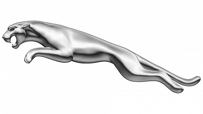
Jaguar is a multinational company with production lines in various countries worldwide. It was founded in 1922 and is headquartered in Coventry, UK. Initially, motorized carriages were produced at its factories, and only then cars. In 1975, the concern went through the process of nationalization. However, today the company is under the control of Tata Motors, being part of Jaguar Land Rover.
The brand’s visual identity is presented in the form of an animal that embodies the image of strength, power, and eleganc

总监微信咨询 舒先生

业务咨询 付小姐

业务咨询 张小姐